Have you ever been mesmerized by those beautifully arranged, bird’s-eye view photos that tell a story with just a glance? That’s the magic of flat lay photography.
This art form has taken social media and e-commerce by storm. It offers a visually captivating way to present products, foods, and everyday items.
But what exactly makes a flat lay photo stand out, and how can you master this technique?
Flat-lay photography involves taking a photo from above and capturing objects on a flat surface. This unique perspective allows for creative compositions and storytelling, making it a favorite among bloggers, influencers, and marketers.
The beauty of flat lay photography lies in its simplicity and versatility.
Whether you’re showcasing the latest fashion trends, a delicious meal, or your favorite tech gadgets, a well-executed flat lay can elevate your content and engage your audience.
In this blog, we’ll dive into the essentials of flat-lay photography, from understanding the basics to exploring advanced techniques.
By the end of this guide, you’ll have a solid foundation in flat-lay photography, equipped with the knowledge and skills to create stunning, share-worthy images.
Let’s get started on your journey to mastering flat-lay photography!
What is Flat Lay Product Photography?

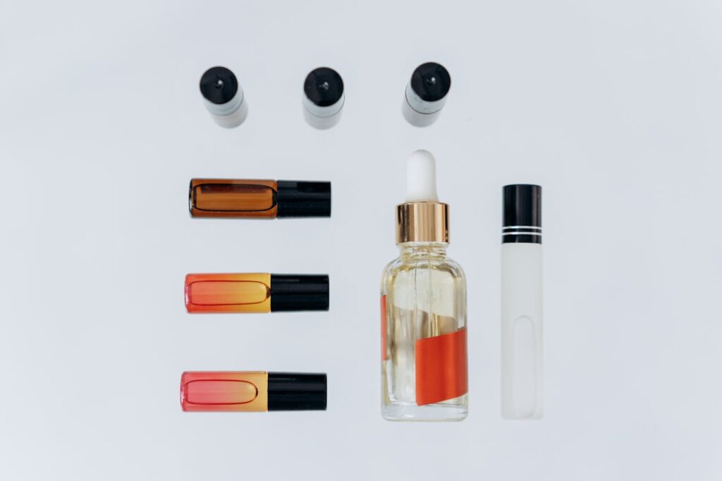
Photo Credit: Mikhail Nilov
Flat lay product photography is a technique where objects are meticulously arranged on a flat surface and photographed from directly above.
This style is known for its ability to showcase items clearly and creatively, making it ideal for various applications such as social media, advertising, and e-commerce.
This perspective provides a clear, unobstructed view of the items. The objects are carefully arranged flat to create a cohesive and aesthetically pleasing composition.
The goal is to create a harmonious and visually engaging image.
Proper lighting is essential in flat lay photography to ensure that the objects are well-lit and shadows are minimized.
A clean, often neutral background is used to keep the focus on the products. Common backgrounds include white or colored paper, wood, marble, or fabric, chosen based on the desired aesthetic.
History and Evolution
Flat lay photography has its roots in both art and commercial photography.
The concept of arranging objects for visual appeal dates back to still-life paintings, where artists carefully composed elements to create balanced and engaging artworks.
In the mid-20th century, flat lay photography became popular in advertising and product photography. It was used in catalogs and print ads to present products organized and detailed.
Today, flat lay photography continues to evolve with minimalism, maximalist, and thematic composition trends. Its visually appealing nature makes it perfect for creating shareable content. Bloggers, influencers, and brands use it to create visually stunning images.
Popularity in Various Niches
Flat lay photography is versatile and popular across numerous niches:
- Fashion: Fashion bloggers and brands use this to showcase outfits, accessories, and makeup. It highlights the details and textures of fashion items.
- Food: Food bloggers, chefs, and restaurants use flat lay photos to present dishes, ingredients, and cooking processes in a delicious and visually engaging manner.
- Tech: Tech enthusiasts and companies use flat lay photos to showcase gadgets, accessories, and setups, emphasizing the sleek design and features of technology products.
- Beauty: Beauty influencers and brands display skincare and makeup products through flat lays, providing a clear and detailed view of the items.
- Lifestyle: Lifestyle bloggers use flat lay photos to share aspects of their daily lives, such as home decor, travel essentials, and stationery, often combining various elements to tell a story or convey a mood.
- Art and Craft: Artists and crafters showcase their creations and materials through flat lays, highlighting the creativity and intricacy of their work.
- E-Commerce: Online stores use flat lay product photography to present products attractively, helping potential customers get a detailed view of the items on sale.
9 Tips for Perfect Flat Lay Product Photography

Mastering flat lay photography requires attention to detail, creativity, and the proper techniques.
Here are some tips to help you achieve stunning flat lay product photos.
Plan Your Composition
Before you start shooting, plan the layout of your items. Consider the story you want to tell and how each element fits into the composition.
A well-thought-out composition can enhance the visual appeal and effectiveness of your photo.
Pay Attention to Lighting
Use natural light whenever possible, and supplement with softboxes or ring lights to eliminate shadows and highlight details.
Good lighting is crucial for capturing your product’s true colors and details.
Choose the Right Background
Select a background that complements your products without overpowering them.
Neutral backgrounds like white, wood, or marble are popular choices.
A suitable background can make your products stand out and look more professional. Research by Justuno indicates that high-quality product images can increase conversion rates by 30%.
Incorporate Props Wisely
Use props to add context and interest to your flat lay, but avoid cluttering the composition. Props should complement, not distract from, the main product.
Props help create a narrative and make the image more relatable. Effective use of props can enhance your flat lay’s overall aesthetic and storytelling.
Maintain Consistent Styling
Consistent color scheme, style, and theme across your flat lays helps to build brand identity and recognition. Especially if you’re creating content for social media or a brand, you should follow consistency.
Focus on Details
Ensure that every element in the frame is clean, well-arranged, and purposeful. Pay attention to small details like product alignment and spacing. It conveys professionalism and quality.
Experiment with Angles and Heights
While flat lay photography is typically shot from above, don’t be afraid to experiment with slightly angled shots to add depth and interest.
Varying angles can make your photos more dynamic and engaging.
According to research by Curalate, images with a unique perspective receive higher engagement on social media.
Edit Your Photos
Editing photos can significantly improve the quality of your images. You may need to adjust brightness, contrast and color balance to make it pop.
You can do it by using image editing software like photoshop or outsource image editing from professionals.
Keep Practicing
Practice regularly and seek inspiration from other photographers. Analyze their compositions and techniques to improve your skills.
Consistent practice leads to improvement and helps you develop your unique style.
Essential Equipment for Flat Lay Photo
Flat lay photography may seem straightforward, but achieving professional and captivating results requires the right equipment.
Having the right equipment is crucial for creating high-quality flat lay photography. While starting with basic gear is possible, investing in specialized tools can significantly enhance your results and provide more creative control over your compositions.
- Cameras and Lenses (DSLR, Mirrorless)
- Tripods and Stabilizers
- Lighting Equipment (Natural light, ring light, softboxes)
- Backdrops and Surfaces (Wood, Marble, fabric, Paper and cardboard.
Setting Up Your Flat Lay: Choosing the Perfect Location and Lighting Setup
Creating the perfect flat lay product photograph starts with selecting an ideal location and optimizing your lighting.
By carefully selecting your location and optimizing your lighting setup, you can create stunning flat lay product photographs that highlight your items effectively and attractively.
Choosing the Perfect Location
- Choose a location near a large window with abundant natural light. Position your setup to make the most of the natural light coming in.
- A tidy, organized space allows better control over your composition and lighting.
- A consistent background helps maintain a cohesive and professional aesthetic.
Optimizing Your Lighting Setup
- Utilizing Natural Light
Natural light is often the best source for flat lay photography due to its soft and diffused nature.
Shoot during daylight hours, preferably in the morning or late afternoon when the light is softer. Use sheer curtains to diffuse harsh sunlight if needed.
Natural light provides even illumination, reducing the need for extensive post-processing. It also helps in capturing true colors and textures.
- Artificial Lighting Options
- Softboxes: Softboxes offer soft, diffused light similar to natural light. Position them at a 45-degree angle to your setup to minimize shadows.
- Ring Lights: Ring lights offer even, shadow-free illumination, which is beneficial for close-up shots.
- LED Panels: Adjustable LED panels allow brightness and color temperature control.
- Light Positioning
Proper positioning of lights ensures even illumination and minimizes shadows.
Place lights at a 45-degree angle to the setup. Use reflectors or whiteboards to bounce light and fill in shadows.
Correct light positioning ensures that products are well-lit, highlighting details and creating a balanced composition.
- Using Reflectors and Diffusers
Reflectors bounce light back onto the subject. It files in shadows and adds depth. Diffusers soften the light. It reduces harsh shadows and glare.
Place reflectors opposite the light source to ensure even lighting. Use sheer fabric or professional diffusers between the light source and the subject.
- Controlling Light with Modifiers
Light modifiers offer greater control over lighting, allowing for more creative and professional results. It helps control the quality and direction of light. Use grids, snoots, and barn doors to direct light precisely where needed and to create desired effects.
Advanced Tips for Setting Up For Flat Lay Photography
- Before starting the shoot, take a few test shots to check the lighting and composition. It helps you identify and correct any lighting or composition issues.
- Adjust your setup based on the results of your test shots. Move lights, change backgrounds, and rearrange items as needed. It ensures you achieve the best possible results, adapting to the unique needs of each shoot.
- Maintain consistency in your lighting and setup, especially when creating a series of photos or content for a brand. It helps build a cohesive visual style crucial for brand identity and recognition.
Composition Techniques in Flat Lay Product Photography
Mastering composition is key to creating captivating flat lay product photographs. By applying composition techniques, you can create visually appealing and tell a compelling story flat lay product photos.
Here are some essential principles to help you achieve balanced and visually appealing compositions. Experimenting with different methods will help you find your unique style and improve the overall quality of your photography.
Rule of Thirds
The rule of thirds involves dividing your frame into a 3×3 grid, creating nine equal sections. The key elements of your composition should be placed along these grid lines or at their intersections.
Positioning objects according to the rule of thirds helps to create balance in your photo. It draws the viewer’s eye naturally to important parts of the image.
This technique prevents the composition from feeling static or centered, adding dynamism and visual interest. According to research in visual arts, images that follow the rule of thirds are perceived as more engaging and aesthetically pleasing.
Symmetry and Balance
Symmetry involves creating a balanced, mirror-like arrangement of objects within the frame. Balance can also be achieved without exact symmetry by distributing visual weight evenly across the composition.
Use symmetry to create a sense of harmony and order. For example, place similar objects on either side of a central item. To achieve balance without symmetry, ensure that different elements counterbalance each other in terms of size, color, or texture.
Symmetrical compositions are creating a sense of stability and elegance. Balanced compositions, even if asymmetrical, feel more dynamic and can effectively guide the viewer’s gaze across the image.
Negative Space
It is the empty or unoccupied areas in a composition. It surrounds and defines the positive space’s edges (the photo’s main subjects).
Use negative space to give your composition room to breathe and to highlight the main objects. This technique can create a minimalist aesthetic, emphasizing the key elements without clutter.
Negative space helps focus attention on the primary subjects, making the composition feel less crowded and more refined. It can also evoke a sense of simplicity and elegance, often visually appealing and calming.
Leading Lines
Leading lines within an image guide the viewer’s eye toward the main subject. These can be actual lines, like the edges of objects, or implied lines created by the arrangement of elements.
Arrange objects in a way that creates lines directed towards the composition’s focal point. For example, the edges of books, the handles of utensils, or even shadows can serve as leading lines.
Leading lines draw the viewer’s attention naturally and help create a sense of depth and direction in the composition. They make the image more engaging by guiding the viewer’s eye through the frame.
Layering and Depth
Layering involves arranging objects at different levels or depths within the composition. This can create a sense of three-dimensionality in a flat lay photo.
Place more significant or dominant items in the foreground and more petite, less important items in the background. Use props and textures to add layers and depth to the scene.
Layering adds complexity and interest to the composition. It makes it more dynamic and visually engaging. It helps create a narrative and can evoke a sense of discovery as the viewer explores different layers of the image.
Color Theory
Color theory involves understanding how colors interact and the emotions they evoke. Complementary, analogous, and monochromatic color schemes can create harmony or contrast in the composition.
Choose a color palette that compliments the products and background. Use colors strategically to highlight certain elements or create a mood.
Effective use of color can significantly enhance the composition’s visual appeal and emotional impact. It can also help create a cohesive and branded look, which is especially important for social media and marketing.
Step-by-Step Guide to Taking Good Flat Lay Product Photos
Taking great flat lay product photos involves carefully ensuring your images are visually appealing and effectively showcasing your products.
Here’s a detailed step-by-step process:
Step 1: Plan Your Concept
- Define Your Purpose: Understand the goal of your flat lay. Is it for social media, a website, or an advertisement? Tailor your concept to match the intended use and audience.
- Create a Mood Board: Gather inspiration and define the overall aesthetic. Use Pinterest or other platforms to collect images that inspire you. Focus on colors, themes, and compositions that resonate with your brand.
- Select Your Products: Choose the main products to be featured. Ensure the products are clean and in perfect condition.
Step 2: Gather Your Equipment
- Camera and Lenses: DSLR, mirrorless, or a high-quality smartphone camera. Try to use a camera with manual settings for better control over exposure and focus.
- Tripod: It helps keep your camera steady for sharp images. Use a tripod to maintain a consistent angle and avoid camera shake.
- Lighting Equipment: Natural light, softboxes, ring lights.
- Backdrops and Surfaces: Wood, marble, fabric, colored paper. Choose a background that complements your products and theme.
Step 3: Set Up Your Space
- Find the Right Location: Choose a space with good natural light or ample room for artificial lighting. A spot near a large window or a well-lit area in your home or studio.
- Prepare Your Background: Ensure the background is clean and flat. Lay down your chosen surface or backdrop.
- Arrange Lighting: Achieve soft, even lighting. Position your light source at a 45-degree angle to your setup. Use diffusers to soften the light and reflectors to fill shadows.
Step 4: Style Your Flat Lay
- Arrange Your Products: Create a balanced and visually pleasing composition. Use the rule of thirds, symmetry, or leading lines to arrange your items. Place the main product first and build around it.
- Add Props: Enhance the main product and add context. Choose props that complement the theme and color scheme. Keep the arrangement uncluttered.
- Create Depth and Texture: Add visual interest to your flat lay. Use different textures and add elements like fabric, wood, or plants.
Step 5: Shoot Your Photos
- Set Up Your Camera: Ensure optimal settings for sharp, well-exposed photos. Set your camera to a high resolution. Use manual mode to control ISO, aperture, and shutter speed. A lower ISO (100-400) for less noise, an aperture around f/8-f/11 for a deeper depth of field, and a shutter speed that avoids motion blur.
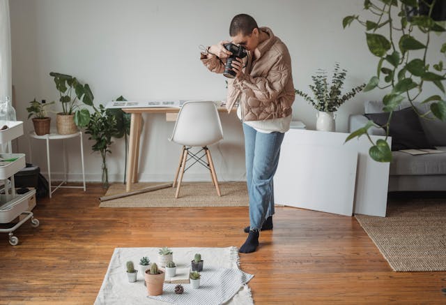
- Compose Your Shot: Frame your flat lay for maximum impact. Ensure the camera is directly above the setup. Use the gridlines on your camera to apply the rule of thirds.
- Take Test Shots: Take test shots to check exposure, focus, and composition. Review test shots and adjust lighting, arrangement, and camera settings.
- Shoot from Different Angles: Capture various perspectives for variety. Take shots from different heights and angles to find the most flattering view.
Step 6: Post-Processing
- Select the Best Shots: Choose the highest quality images. Review your shots and select the best composition, lighting, and focus.
- Edit Your Photos: Enhance your images to make them stand out. Adjust brightness, contrast, sharpness, and color balance. Crop and straighten as needed.
- Consistent Editing Style: Maintain a cohesive look across your photos. Apply similar edits to all images in a series to ensure consistency in style and tone.
Step 7: Final Review and Export
- Review Edited Photos: Ensure all details are perfect. Check for any flaws or inconsistencies and make final adjustments.
- Export High-Quality Files: Prepare your photos for their intended use. Export images in the appropriate format and resolution. For web use, JPEG or PNG is at 72 dpi; for print, TIFF is at 300 dpi.
Do’s and Don’ts of Flat Lay Photography
Do’s
- Do Plan Your Composition
- Plan Ahead: Sketch out or mentally plan your composition before starting.
- Balance Elements: Use the rule of thirds, symmetry, or leading lines to create a balanced layout.
- Do Use Good Lighting
- Natural Light: Utilize natural light whenever possible for soft, even illumination.
- Artificial Light: When using artificial lights, ensure they are diffused to avoid harsh shadows.
- Do Pay Attention to Backgrounds
- Clean and Simple: Choose a clean, uncluttered background that complements your products.
- Texture and Contrast: Use backgrounds that add texture and contrast but don’t overpower the main subjects.
- Do Use Props Wisely
- Complementary Props: Select props that enhance and add context to the main product.
- Minimalism: Keep the number of props to a minimum to avoid clutter.
- Do Experiment with Angles and Heights
- Top-Down Angle: Typically, a top-down angle works best for flat lays.
- Try Variations: Slightly change the height and angle to add variety and find the most flattering view.
- Do Focus on Details
- Sharp Focus: Ensure all key elements are in sharp focus.
- Clean Products: Ensure products are clean and free of fingerprints, dust, or smudges.
- Do Edit Thoughtfully
- Consistent Editing: Apply consistent edits to maintain a cohesive look across all photos.
- Enhance, Don’t Overdo: Adjust brightness, contrast, and colors to enhance the image, but avoid over-editing.
Don’ts
- Don’t Overcrowd Your Composition
- Avoid Clutter: Too many items can make the photo look busy and distract from the main product.
- Keep It Simple: Stick to a few essential elements for a clean and focused composition.
- Don’t Ignore the Lighting
- Avoid Harsh Light: Direct, harsh light can create unwanted shadows and highlights.
- Avoid Dim Light: Insufficient lighting can make the photo dull and unprofessional.
- Don’t Neglect the Background
- Busy Backgrounds: Avoid backgrounds with too many patterns or colors that clash with the products.
- Unclean Backgrounds: Ensure the background is spotless and in good condition.
- Don’t Use Irrelevant Props
- Unrelated Items: Props should be relevant and add value to your story.
- Overuse of Props: Too many props can confuse the viewer. It also detracts from the main subject.
- Don’t Forget About Color Harmony
- Clashing Colors: Use a cohesive color scheme that complements the main product.
- Overwhelming Colors: Avoid using too many bright colors that overwhelm the viewer.
- Don’t Ignore Composition Rules
- Random Placement: Placing items haphazardly can lead to an unbalanced and unappealing photo.
- Disregard of Negative Space: Use negative space effectively to let the composition breathe.
- Don’t Rush the Process
- Hasty Arrangements: Take your time to arrange items thoughtfully and with purpose.
- Test Shots: Always take test shots to ensure lighting and composition are perfect before the final shot.


